Key Takeaways
- Scrolling in List View is time-consuming, taking multiple turns to find an app.
- Widgets show that an alphabetical scroll feature can speed up app selection.
- This single change could make List View for apps so much better.
When new Apple products are launched, the updated software is always a big deal. The excitement around iOS 18 this year is focused largely on the upcoming Apple Intelligence features, with macOS Sequoia also gaining some AI-powered tools.
There’s one OS that never really gets the same level of love, however. On the Apple Watch, watchOS 11 adds some useful new features, including a brand-new Vitals app, training load analysis, and sleep apnea detection, making some significant upgrades to watchOS 10. There’s one feature that’s still missing, however, and it’s something I’ve been wanting Apple to add for a long time. Here’s the one thing that I really wish Apple had added to watchOS 11.
Opening the Workouts app makes me lose the will to live
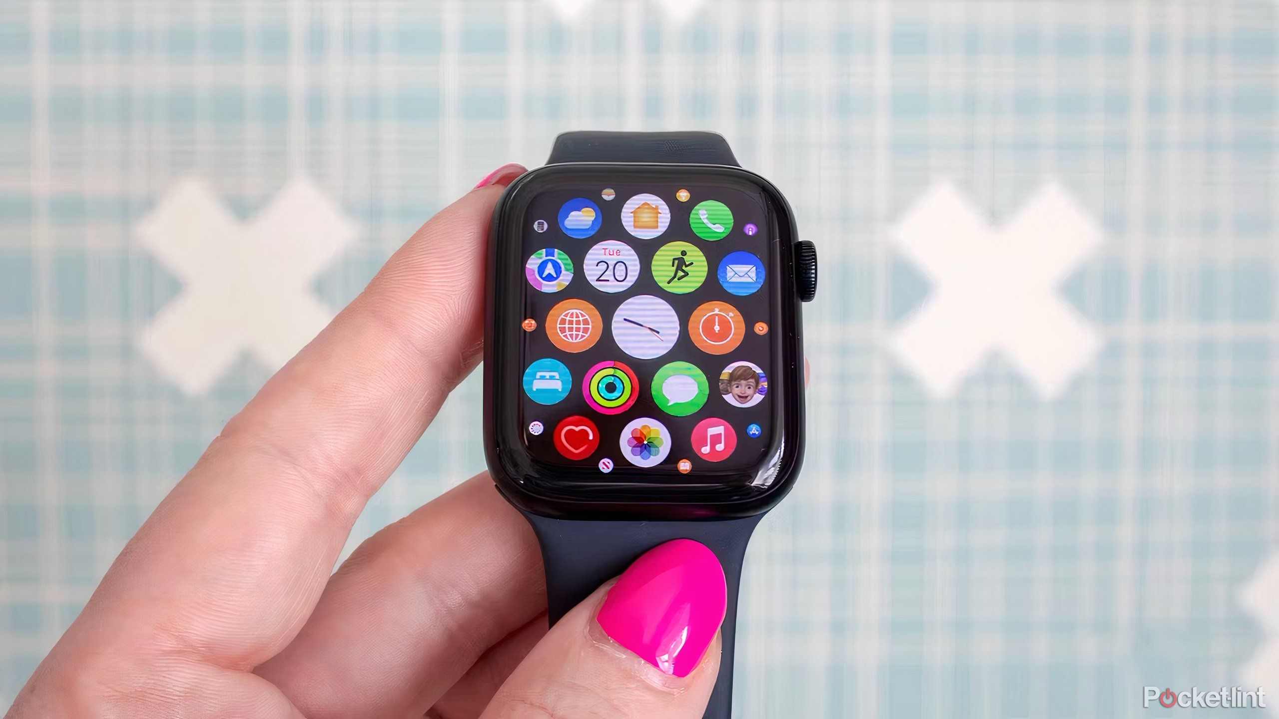
There are two types of Apple Watch users; those who use Grid View and those who use List View. In Grid View, all your apps are displayed as a collection of small icons that you can scroll through to find the app you need. App View displays all of your apps in one long, alphabetical list.
If you’re a Grid View fan, you may not even be aware that this is a problem. Sure, you have to scrabble around trying to spot an app you use so little that you’re not really sure what the icon looks like. You don’t have to face the biggest problem with List View, however: the endless scrolling.
If your Apple Watch is stacked with apps like mine is, you can find yourself turning the digital crown more than 30 times before you get to the Ws and can open the Workout app. It’s a workout in itself.
You open List View with a press of the digital crown. So far, so good. Turn the digital crown to start scrolling through the alphabetical list. And then keep scrolling. And scroll a little more. If your Apple Watch is stacked with apps like mine is, you can find yourself turning the digital crown more than 30 times before you get to the Ws and can open the Workout app. It’s a workout in itself.
Swiping on the screen is a little faster but is still a serious effort, and when you’ve just pressed the digital crown to open List View, it feels more natural to keep turning it to scroll through the list. Regardless of which method you use, selecting the app that you want to open shouldn’t be this hard. There is a simpler way, and Apple already knows how to do it.
Other areas of watchOS show there’s a simple solution
Selecting widgets requires far less scrolling
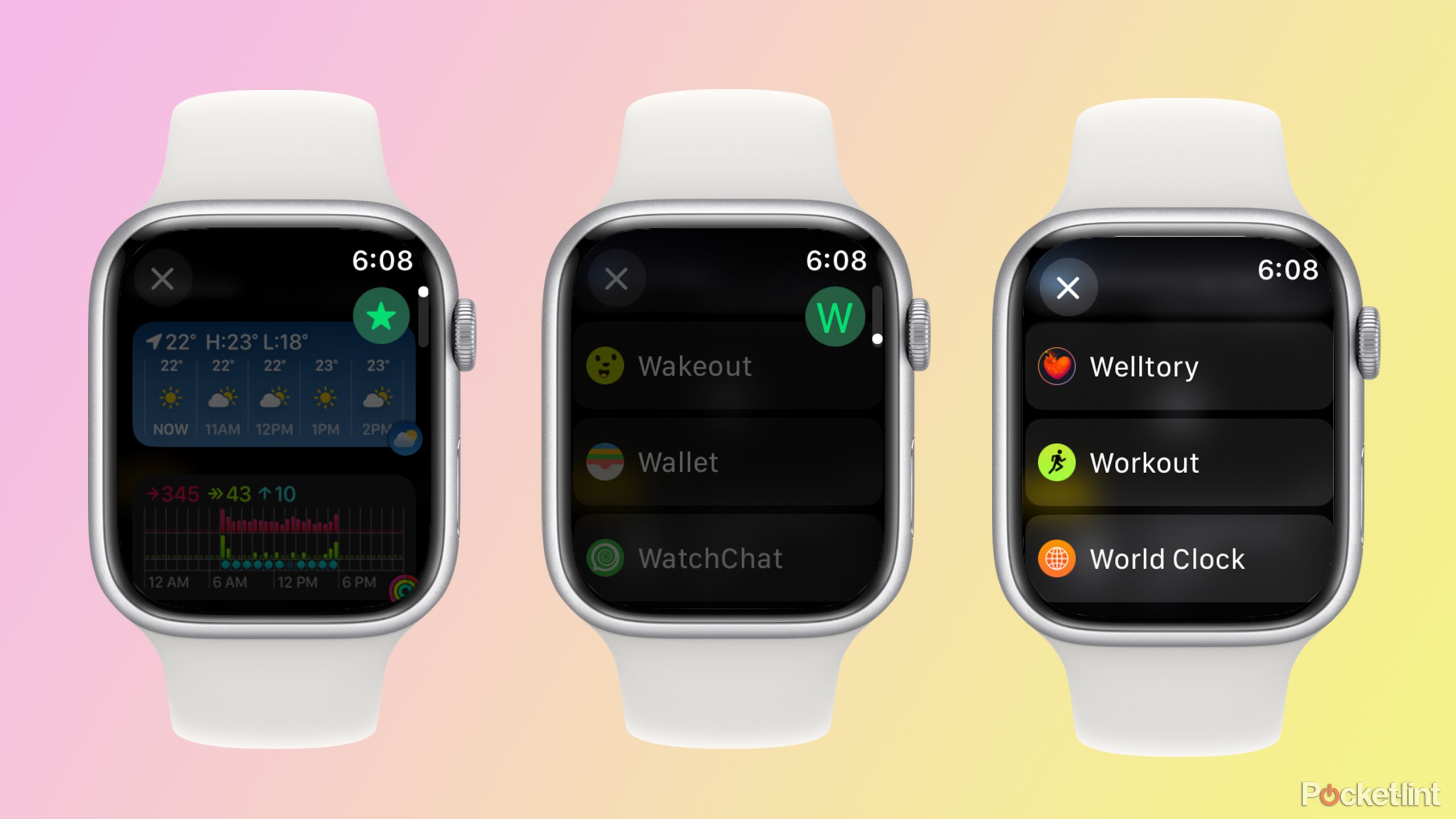
The most frustrating thing is that the perfect solution to this problem already exists on your Apple Watch. If you want to add a new widget to your Smart Stack, you can press and hold any of your current widgets and then tap the Plus button to select a new widget.
This is where the magic happens. If you scroll at a reasonable rate through the list of apps that offer widgets, it works exactly the same as it does in List View. However, if you scroll faster, your Apple Watch stops scrolling through the apps one at a time and starts to scroll through the alphabet instead.
You get a small icon at the top right of the screen showing the current letter. If you want to select the Medications app, for example, you quickly scroll through the letters until you reach M, pause for a moment, and then you can carry on scrolling through the apps that start with the letter M.
Using this method is so much faster. I was able to get to the Workout widget using this method in just a few scrolls of the digital crown, as opposed to the more than 30 it takes in List View. The software to make this happen already exists on the Apple Watch, so there’s really no reason why the same function can’t be applied to selecting apps in the List View.
Things got even worse in watchOS 10 for a while
List View would always return to the top of the list
Apple/Pocket-lint
The current state of List View is bad enough, but for a while it got even worse in watchOS 10. In watchOS 9, List View was annoying to use, but it had a feature that made it a little more bearable. Once you had scrolled through List View and selected an app, the next time that you opened List View, it would still show the same app that you opened last. If you opened the Workout app, for example, then the next time you opened List View, you would still be deep in the Ws in the alphabetical list.
However, with the release of watchOS 10, this feature went away. Instead, every time you opened the List View, it would be back to the start of the list again. If you opened the Workout app from the List View, and then wanted to open it again later that day, the list would have returned to the top, and you’d have to scroll the whole way through to the Workout app all over again.
Thankfully, this was fixed in watchOS 10.4, which returned to always showing the last place that you were in the list. It was a huge relief to discover that this was still the case in watchOS 11.
List View is still my app view of choice
It could be so much better with just a single change
List View has its problems, but I still prefer it to Grid View simply because it’s easy to find apps that you don’t use as often from an alphabetical list than from a random layout of tiny app icons. If I only ever used the same few apps all the time, the Grid View would allow me to keep the most used apps at the top, but when I’m using different apps, being able to find them alphabetically is far less frustrating.
What is frustrating is the amount of unnecessary scrolling I have to do, and it’s even more annoying knowing that Apple has already come up with a solution for this problem elsewhere on the Apple Watch, and still hasn’t applied it to the List View. I was hoping that watchOS 11 might finally be the time for the Apple Watch to add this much-needed feature, but sadly my wait goes on.
Trending Products

Cooler Master MasterBox Q300L Micro-ATX Tower with Magnetic Design Dust Filter, Transparent Acrylic Side Panel…

ASUS TUF Gaming GT301 ZAKU II Edition ATX mid-Tower Compact case with Tempered Glass Side Panel, Honeycomb Front Panel…

ASUS TUF Gaming GT501 Mid-Tower Computer Case for up to EATX Motherboards with USB 3.0 Front Panel Cases GT501/GRY/WITH…

be quiet! Pure Base 500DX Black, Mid Tower ATX case, ARGB, 3 pre-installed Pure Wings 2, BGW37, tempered glass window

ASUS ROG Strix Helios GX601 White Edition RGB Mid-Tower Computer Case for ATX/EATX Motherboards with tempered glass…


